Gold And Silver Prices: Boom Or Bust?
Gold and silver prices are at a critical point. It appears that we will see massive price movements up or down, soon. Conditions are very similar to that of the early 80s (circa 1983), like when the Dow Index had just made a significant breakout…after a 17-year consolidation. See below, a long-term chart for the Dow Index (generated at tradingview.com):

In 1966 the Dow made an all-time high, while the Dow/Gold ratio peaked. It took about 17 years from that peak (1966 to 1983), for prices to break sufficiently higher than that 1966 level. Furthermore, about three years before the breakout, the gold price made a significant all-time high (in 1980).
The Dow eventually went higher over the next years, to multiples of the breakout level.
Today, the Dow recently (at the beginning of 2017) made a significant breakout from a resistance line that has been in place for about 17 years since the Dow/Gold ratio, and the Dow (at that time) made an all-time high. In a similar manner to the 1983 scenario, gold made a significant all-time high about 5 years before.
Now, just like in 1983, the feeling is that the Dow will continue to rise much higher than current levels. Due to this similarity, many are calling for a new bull market in stocks, taking the Dow to even greater highs, like 40 000 and beyond. Although it is understandable why they feel so; it is more likely to end in great despair for those stock market bulls.
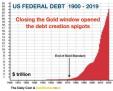
There are just too many obstacles for a new bull market in stocks, with the major one being the all-time high debt levels. However, I will not go into detail about this in this article, since I would like to focus on gold and silver.
The similarities to 1983 are also reflected in the gold and silver charts, and this highlights the dilemma that these metals find themselves in. Below is a long term chart for gold:

I have marked two patterns 1 to 5, to show how they might be similar. The comparison is very plausible, especially given the fact that the Dow is currently in a similar position, as explained above.
If the comparison with the 1980s pattern is justified, and the current pattern continues in a similar fashion, then gold will continue in a long bear market. However, there are just too many fundamental obstacles to such a scenario, since gold appears to be ready for the next phase of the bull market which started around 2000.
From a technical perspective, price is currently at a critical point, which could show whether we will have the expected bull market, or the very unlikely bear market. A breakout at the top red line (the high at point 5) would almost certainly signal or confirm the bull market. This would be divergence from the 1980s pattern, and likely cause prices to rise really fast once the breakout is confirmed.
This, in my opinion, is the most likely outcome.
A breakdown at the bottom red line, could mean that gold prices could continue to follow the 1980s pattern, and go lower than $1000.
Below is a long-term chart for silver:

I have marked two patterns 1 to 5, to show how they might be similar. The comparison is very plausible, especially given the fact that the Dow is currently in a similar position, as explained above.
If the comparison with the 1980s pattern is justified, and the current pattern continues in a similar fashion, then silver will continue in a long bear market. However, there are just too many fundamental obstacles to such a scenario, since silver appears to be ready for the next phase of the bull market which started around 2001.
From a technical perspective, price is currently at a critical point, which could show whether we will have the expected bull market, or the very unlikely bear market.
A breakout at the top red line (the high at point 5) would almost certainly signal or confirm the bull market. This would be divergence from the 1980s pattern, and likely cause prices to rise really fast, once the breakout is confirmed.
This, in my opinion, is the most likely outcome.
A breakdown at the bottom red line, could mean that silver prices could continue to follow the 1980s pattern, and go much lower than point 4.
A major fundamental reason why the current scenario for gold and silver will not play out like it did in the 80s, is the massive debt levels combined with the interest rate cycle, which appears to have turned (with higher interest rates coming).
Below, are the same gold and silver charts compared to interest rates:


On both charts, one can see that around 1983, interest rates were close to all-time highs, and had just turned (1981) to trend lower (from a long-term perspective) over the next years. This created positive conditions for general stocks, and adverse conditions for silver and gold.
Currently, interest rates are close to all-time lows, and appear to have turned, with higher interest rates coming. This will create adverse conditions for general stocks, and very positive conditions for silver and gold.
For more on this and this kind of fractal analysis, you are welcome to subscribe to my premium service. I have also recently completed a Silver Fractal Analysis Report as well as a Gold Fractal Analysis Report.
********
Gold-Eagle provides regular commentary and analysis of gold, precious metals and the economy. Be the first to be informed by signing up for our free email newsletter.
More from Gold-Eagle.com: