The Coherent, The Foremost And The Remarkable
The previous week was quite rich in important events. Silver rallied significantly on Wednesday and mining stocks underperformed significantly on Thursday. Gold declined significantly after moving to the previous high, but without a breakdown to new 2018 lows the situation remains tense, especially that the USD Index is fighting to break above an important support / resistance line. These signals may seem random, but if you’ve seen similar cases many times before, it all becomes coherent. Especially, when it’s confirmed by very long-term charts of utmost importance and by little-known but remarkably effective techniques. In today’s analysis, we discuss all of the above.
There are quite a few things that we want to cover today: the short-term issues are important as that’s where the most changes are, and the long-term issues are critical and since we didn’t provide an update on some of them in the recent past, we want to catch up. On top of the above, there is something that’s extremely interesting and likely very useful that we just have to share with you.
It took some time to prepare today’s analysis, but while we can’t promise certainty regarding future price movement, we can and do promise to give you our absolute best in our articles. And we deliver. With all the above in mind, we just couldn’t not let you know about all these important issues.
As a consequence, today’s analysis is rather big, so if you’re short on time, you may want to scroll down to the Summary section. Naturally, if you have time, we hope that you’ll enjoy reading today’s analysis in its entirety.
Let’s start with the most recent price changes (charts courtesy of http://stockcharts.com).
The Coherent

The USD Index moved above the declining resistance lines and closed above it for 3 consecutive days. The breakout is therefore confirmed. We can’t say the same about the USD’s relation to the other resistance line – it hasn’t closed above it so far. So, overall, based on the above chart, the outlook for the USD improved, but just a little.

The medium-term declining support / resistance line is providing resistance so far and our precious comments on it remain up-to-date:
To be more precise: the declining support / resistance line is currently at about 90.20. Today’s pre-market high according to finance.yahoo.com is 90.24 and the current price at the moment of writing these words is 90.05. The USD Index is now fighting for a breakout. Still, if we see one, we won’t view the outlook as dramatically improved until the breakout is verified – preferably by a close above the previous February 2018 high (90.45).
There was already a failed attempt to move above this line, so we are skeptical toward a small breakout above it. After all, if the previous small breakout was followed by invalidation several days ago, it becomes unclear if the next breakout will be successful. We might see another small move lower or we might see a breakout right away. The latter is more probable, but based on the previous failed breakout, we wouldn’t dismiss something similar to it just yet. A confirmed breakout above 90.5 (approximation of the mentioned 90.45) will be a very good sign that the breakout above the support/resistance line is going to hold and that the final bottom is definitely in for the USD Index.
The mentioned support / resistance line is not willing to give up without a fight and this may be a blessing for us. If the USD Index moves to 89.11 or so (the highest of the nearby long-term support levels), we might see yet another very bearish confirmation, which would make the overall outlook for the short term even more bearish. In consequence, we might increase the speculative short position even further. Again, that is a big “if” at this moment and we’ll keep monitoring the market and report to you accordingly.
Overall, the short-term picture for the USD is tense, but it improved based on Friday’s closing prices as one of USD’s short-term breakouts was confirmed.

Gold barely moved yesterday, but it’s notable that the direction of the move was down and that the volume was very low. Both factors are important because of other markets. Let’s start with the latter.

The low volume in gold was confirmed by low volume in silver, so it’s something that’s worth investigating. Upon closer inspection, it occurred that the very low-volume days in silver (when confirmed by analogous price-volume action in gold) after days of rather regular volume were seen in quite similar situations.
In September 2017 it was seen twice. In one situation, silver traded higher for a day only to decline on the very next day. The second time was followed by an immediate intraday rally that was then followed by a quick decline. Shortly thereafter silver bottomed. The third time was seen right before a 40+ cent daily jump that was followed by a consolidation and then lower prices. The fourth time was seen before a move lower that was the final low of the month. A sizable rally followed. The fifth time was seen in January 2018, when silver was just before the daily decline that was followed by a 40+ cent daily upswing.
So, in 5 out of 5 cases, similarly low volume during a daily decline meant that we’d see a trick move very soon that would be followed by a bigger and much more important move in the opposite direction. In 4 out of 5 cases, however, it was followed by a fake downswing either immediately (last 3 cases) or in a few days (the second case). Only the first case was followed by an immediate upswing.
What does the above tell us? That whatever price swing we see on Monday, could be fake. It’s not 100% certain that it will be fake, but we should not trust it blindly. If we see a daily rally, then it could be the final chance to add to the short positions. If the move is to the downside, then we may consider limiting our exposure here.

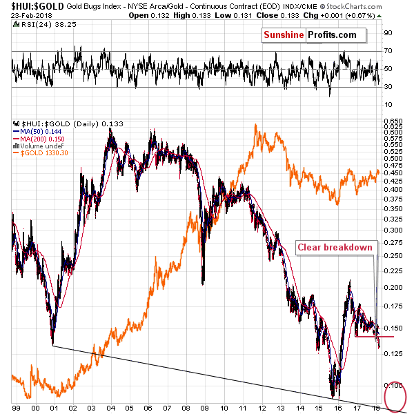
The fact that gold declined is important in relation to the performance of the mining stocks, because the latter moved higher. What’s even more interesting, the latter moved higher on low volume. The question, therefore, is if the upswing on low volume is bearish, or is the miners’ daily outperformance bullish.
We’re leaning toward the first interpretation and the reason is what happened on Thursday. Mining stocks declined while gold rallied and the strength of this opposite – and bearish – signal was stronger than what we saw on Friday.

Looking at the last two trading days together still shows significant underperformance of gold stocks.

The HUI to gold ratio shows only a small correction that followed a big daily decline. Therefore, Friday’s upswing should not be trusted – it could be just a pause after a breakdown below the previous February low.
We don’t view this action as invalidation of the breakdown, because such invalidations have only had limited impact in the past. Please note what happened in late October 2017 and early November 2017. The ratio moved above the previous lows many times and yet it was just a lengthy consolidation after which the decline resumed.
Overall, the short-term chart points to a possibility of seeing higher precious metals prices, but only temporarily. Please note that a possibility here doesn’t mean certainty. The big surprises are likely to be to the downside, so one needs to be very careful about projecting upswings. Why would this be the case? Because of the long-term factors.
The Foremost

First of the long-term factors that are in play is the situation in the USD Index. The 90.20 level that we discussed previously is not as important as the invalidations of breakdowns below the 4 very important long-term support levels.
The combination of the 2009 and 2010 tops along with 2 major retracements based on major extremes (marked in red and black on the above chart) is much stronger than the declining support / resistance line that we described in the previous section. The reason is that the mid-2015 and 2016 lows are less prominent than the 2009 and 2010 tops and the line based on the former is not strengthened by key Fibonacci retracements, while the latter is.
Since the bullish developments are more important than the bearish ones, the outlook for the following months remains bullish. Still, the bullish factor is more long-term-oriented and the bearish factor is more short-term-oriented. Consequently, we should still take into account the possibility that we may see short-term weakness in the USD, but that will most likely be just a way of the USD preparing for a bigger upswing that will follow.
The implications for the precious metals market are exactly opposite. Namely, we may see short-term strength in the PMs, but that will most likely be just a way of the PM market preparing for a bigger downswing that will follow.

The situation on silver’s long-term chart continues to develop in line with our previous comments. We described the situation in detail 3 weeks ago and since that time, silver declined, and we saw a correction within this downswing. Consequently, everything that we wrote previously on the silver market remains up-to-date:
We expect silver to move lower very substantially before bottoming. The white metal’s decline should scare precious metals investors away from the market and the investors’ sentiment should be extremely unfavorable before the huge bull market in silver can resume. That’s the factor that was missing in late 2015 – people were not scared or very bearish – as they should have been at a key bottom. Consequently, it doesn’t seem that late 2015 was indeed the final bottom.
If the 2015 bottom was not the final one, then silver is going below it. Let’s check how much below the $14 level the silver price could go.
In order to do this, we’ll apply two techniques that we’re using in the case of other charts and we’ll remind you about something that we discovered a long time ago, but that remains to be very up-to-date also today. We get the feeling that you are most interested in the latter, so let’s start with it.
Please note the orange ellipses and lines on the above chart. You can see them in late 2007, in 2008, 2015, 2016 and 2017. You see, starting from the bottoms marked with orange ellipses, the price moves that are marked with the lines are practically identical – at least so far. The price moves are not identical only in the case of their range. The starting and ending points are extremely similar as well.
In both cases, silver bottomed a bit below $14 and quickly soared above $21. Then it declined to about $16 (in both cases). Then it rallied to about $19 (again, in both cases). Then it moved lower once again and declined very far dramatically before moving above the previous highs. Back in 2008, the decline was seen quickly. In this case, silver is taking its time. Does this invalidate the analogy or does it make it any less valid?
No. Back in 2008 silver’s decline got help from a strong rally in the USD and now, silver gets a boost from a huge decline in the USD. A decline that seems to be ending, but let’s stay with silver for a while. The important observation is that silver should have rallied given the decline in the USD from about 100 to below 90 over the last year. It didn’t. It’s actually even lower than it was during the 2017 top.
The analogy to 2008 wasn’t invalidated – it was just significantly delayed. When the circumstances are analogous, and the USD starts a rally, the silver market is likely to perform just as it did in 2008 or at least similarly. This means that we can expect silver to move to $10 or perhaps even temporarily below it before the final bottom is reached.
As we wrote above, that’s only one technique that points to these levels. The other two ones are the analogy to the 2013 decline and the lower border of the declining trend channel.
We marked the former with the declining dashed lines. The boldest of them marks the most likely analogy – if the top that we are – most likely – currently seeing is indeed the start of the final decline, then it is precisely this analogy that we should be focusing on.
The lower border of the trend channel is parallel to the line based on the key tops of the 2011 – today decline. That’s a classic way to create a support line, so it doesn’t seem to require a lot of commentary. Trend channels work in most markets and silver is one of them, so adding this kind of support is useful.
What does it all leave us with? Silver is likely to slide much lower before the decline is completely over. In fact, it could go to levels that appear shocking or unbelievable at this time. Before dismissing the above, please note that a move from the current levels to single-digit prices already took place less than ten years ago. Why wouldn’t it be possible for history to repeat itself? After all, that’s the thing that it tends to do.

If silver’s prediction sounds crazy, then the one for gold miners will definitely not sound sane either. Should the 2012 – 2013 slide be repeated, then we can expect the HUI Index to decline all the way to about 80 (or temporarily lower if the general stock market plunges at the time of the miners’ decline).
Before automatically denying such a possibility and calling it absurd, please note that declines similar to the one that we currently think is ahead (naturally, the outlook may change when new information becomes available – we’re not marrying the outlook) already happened – in 2008 and 2013.
The most interesting thing about the above gold stock chart, however, is the proximity of the support levels. Once the HUI Index breaks below the previous 2018 and 2017 lows (and it certainly seems that we won’t have to wait long), the next support is the late 2016 low at about 160. Then there’s 150, which is significant as that’s the 2008 bottom and it already worked as support twice in late 2014. Once miners break below the 150 level there’s no meaningful support until they reach their previous lows at or a bit above 100.
So, at the same time the 100 level may seem to be at a distance, but it’s only 3 breakdowns away. If we assume that the closest breakdown will be seen shortly, then it’s effectively only 2 difficult breakdowns away.
Why would we assume that the breakdown below the 2017 lows and the 2018 low is about to be seen shortly?
Because the key gold-stock ratios are already after critical breakdowns. The gold miners’ prices compared to the price of gold is clearly in a free fall after breaking below the 2017 lows. Unlike the HUI itself, which still has a few support levels that could trigger rebounds, the HUI’s ratio to gold is now likely to decline much lower without bigger corrections along the way. In other words, gold mining stocks’ underperformance seems to be like the “new normal” for the next several months.
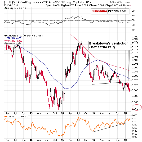
The miners’ ratio to the general stock market is in a very similar position. In this case, we saw a verification of the breakdown, which is likely a consequence of the drop in the value of the USD Index. The USD declined significantly from December 2017 and is still very close to the previous lows. Yet, miners have already stopped caring about this bullish factor and reversed their course and are now even lower than they were in December.
Mining stocks are underperforming virtually everything else that’s important for gold and silver investors and this is the thing that we saw before and during the 2012 – 2013 decline. The implications are very bearish for the following weeks.

The long-term gold chart shows the potential size for the decline if the 2012 – 2013 decline is repeated and as you can see the target a bit below $900 is based also on a few other important techniques.
The 61.8% Fibonacci retracement based on the entire bull market, the declining red support line, gold’s long-term cyclical turning point and the apex of the reversal triangle (rising black line together with the declining blue one create the triangle) all point to a major bottom in gold in late September 2018 or early October 2018.
Moreover, let’s keep in mind that gold’s increase in volume in the past months (marked with a red rectangle) has no bullish implications and it can even be viewed as bearish. Yes, we realize that quite a few people noted that the increase in volume during the upswing in gold should have bullish implications, but that’s just an oversimplification of this matter.
The reason is provided by the context and there are multiple factors that make any bullish implications rather irrelevant:
-
The volume was high in 2016 and 2017 and so was the price, but if we consider the starting and ending price of 2016 (and the intra-year high) and we consider the same for this year (taking the current price instead of the yearly closing price), we’ll see that the yearly performance is not a clear rally (a big bright candlestick on a yearly candlestick chart) - it’s a… reversal, especially in the case of 2016. In 2016 gold rallied from $1,060 to $1,377 only to close the year at about $1,152, invalidating most of the rally. Huge volume confirms the bearish implications of reversals, so the implications here are bearish rather than bullish. By the way, the months with the highest volume in both 2016 and 2017 were the ones when gold declined.
-
Gold’s increase in yearly volume in terms of futures is not confirmed by yearly volume levels for the GLD ETF (this also applies to other precious metals ETFs, for instance PHYS and for the Central Fund of Canada). Yes, the volume for 2016 was higher than for 2015, but not as high as it was in 2010 or 2011. The 2017 performance is also far from spectacular - it appears that the 2017 volume for the GLD ETF will be lower than in 2016. Consequently, it could be the case that the increase in gold futures’ volume is not suggesting anything very bullish for the gold market, but it simply shows an increase in the interest in the futures market. The following points seem to confirm it.
-
Gold is not the only market where the futures volume moved to record highs. The same is the case with crude oil and copper. Why is the commodity futures’ volume soaring, but not the one for the GLD ETF? Because the likely common denominator is not the performance of gold, but the interest in the futures market.
-
When gold futures’ volume previously increased substantially, it meant that bigger declines were to be seen in the following months - this happened in 2008 and 2011 (we marked both cases on the above chart – please note the volume spike at the top in the 2008 and compare it to the recent analogous spike). So, why would the move above the previous highs in the volume levels mean something else than a bigger decline this time? “This time is different” is often a costly phrase.
All in all, it doesn’t seem that the increase in the volume levels in the gold futures market is significant and it’s definitely not something to be viewed as bullish.
But, the issue that we want to particularly focus on today is not volume, but the apex triangle technique.
For those, who are not familiar with it, the reversals tend to take place at the apex of a triangle. Simple as that and remarkably effective in the case of the precious metals market. There are many examples that confirm the high efficiency of this technique and the latest one is the February 9 reversal in gold stocks.
The Remarkable
If you look closer on the gold’s long-term chart, you’ll see that the triangle that the rising black line makes with the declining blue one is note the only one. There’s also a declining green line (based on the 2012 and 2016 highs), which forms a triangle with an apex… Just about now.
The declining green line is significant, because it’s actually based on more than the 2012 and 2016 highs. It was verified as resistance in mid-2017 and as support in late 2017. Should an apex of a triangle that’s based on two important medium-term lines, be viewed as something important? You bet!
That’s why we decided to inspect this triangle much closer.

The above closing-price-based chart features the triangle with the apex approximately last week. The implication here is that gold has most likely formed a major top this month.
So, gold is going to plunge right away?
Not so fast.

The above chart shows exactly the same thing, but this time, the lines are based on intraday extremes instead of the closing prices.
In this case, the apex of the triangle is about 2 weeks away. The difference is small when viewing gold’s performance from the long-term perspective, but in case of the implications for short-term gold trades, the difference is huge.
On one hand, we have a reliable technique that suggests that we have already seen a top, and on the other hand, the same technique, but applied a bit differently suggests that we can see about 2 more weeks of higher prices, before gold really tops and starts a major downswing.
Which interpretation should one trust? We don’t think that we should make the choice at all. Instead, we should take both possibilities into account and see how they fit all the other signals that we discussed previously.
Based on the USD Index, we could see a temporary downswing, which is not likely to be anything to call the home about and the opposite could be seen in the case of the precious metals market. Of course, that’s just a possibility, as the USD could break through 90.20 right away as the major long-term factors continue to have bullish implications. The low volume in gold and silver suggests that the move that we’re going to see today might be fake. The mining stocks’ performance is generally bearish, but there is still a possibility of another counter-trend upswing, as that’s what happened during previous volatile declines.
Keeping the above in mind, how does the -mentioned apex triangle reversal technique help us? In short, it confirms the previous paragraph and the tension that it implies. The question is how to deal with all this.
The full version of today’s analysis includes a specific game plan and a pre-market update for taking advantage of both possible outcomes and while we’ll make it available to our subscribers, we can say that whether precious metals rally in the next two weeks or not, the bigger trend is still very likely to remain down. The possible upswing should not be automatically viewed as something particularly bullish.
Summary
Summing up, the top in gold, silver and mining stocks is probably in, but there’s still a possibility that the PMs decline will be delayed by another 2 weeks or so. There are multiple long-term bearish factors in place, and they are confirmed by several short-term signs as well. There are, however, a few signs that point to yet another counter-trend rally in the next 2 weeks or so and today’s session might help to clarify whether the bearish or bullish outlook is likely to prevail in the very near term. In both cases, however, the outlook for the following months will remain bearish.
Przemyslaw Radomski, CFA
Founder, Editor-in-chief, Gold & Silver Fund Manager
Sunshine Profits - Free Gold Analysis
*********
All essays, research and information found above represent analyses and opinions of Przemyslaw Radomski, CFA and Sunshine Profits' associates only. As such, it may prove wrong and be a subject to change without notice. Opinions and analyses were based on data available to authors of respective essays at the time of writing. Although the information provided above is based on careful research and sources that are believed to be accurate, Przemyslaw Radomski, CFA and his associates do not guarantee the accuracy or thoroughness of the data or information reported. The opinions published above are neither an offer nor a recommendation to purchase or sell any securities. Mr. Radomski is not a Registered Securities Advisor. By reading Przemyslaw Radomski's, CFA reports you fully agree that he will not be held responsible or liable for any decisions you make regarding any information provided in these reports. Investing, trading and speculation in any financial markets may involve high risk of loss. Przemyslaw Radomski, CFA, Sunshine Profits' employees and affiliates as well as members of their families may have a short or long position in any securities, including those mentioned in any of the reports or essays, and may make additional purchases and/or sales of those securities without notice.

Przemyslaw Radomski, CFA, is the founder, owner and the main editor of SunshineProfits.com. You can reach Przemyslaw at: http://www.sunshineprofits.com/help/contact-us/.
More from Gold-Eagle.com: