Silver Measures Wealth While Gold Stocks Increase It


Silver is one of the commodities with the most potential to rise in value over the remaining years of this decade. While silver increases in value, it will be increasingly difficult to add to one’s silver ounces.
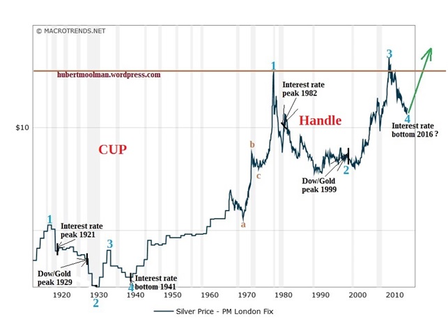
Below is a chart (from macrotrends.net) that illustrates silver’s potential to rise over the coming years:

The chart shows that at the beginning of 2016, silver entered a new phase of rising prices (more details and analysis of the chart). This is likely to continue beyond 2019.
Given the likelihood that silver will become the new (old) standard by which wealth is measured, the risk of becoming poorer (in silver ounces) is greatly increased.
Earning income, from a business or employment remain of the best ways to continue increasing one’s silver ounces, but to maintain one’s real income levels (in terms of silver ounces) increasingly higher income (in terms of other measures) will be required.
However, the economic conditions during this silver and gold boom, is that of reduced economic activity, that will severely limit the opportunities to earn income through employment or business, that in turn limits the ability to earn increasingly higher income.
This is a taste of the type of economic depression that we are in, and that is about to intensify.
So, to increase one’s net worth, as well as, maintain and even increase one’s income levels, a great asset and income strategy is required.
It comes down to more than just keeping one’s assets in silver, but also in the form of goods that will actually outperform silver over the next years. This will increase one’s risks, but that is required in order to increase wealth.
Furthermore, income should be converted to silver (even better if it is directly earned in silver ounces) and goods that are likely to outperform silver as soon as possible.
There are very few goods or returns from activities that will actually outperform silver over the coming years. Personally, I feel the most realistic way to increase one’s silver ounces is to invest in gold and silver mining stocks.
It does have its unique risks, as well as, additional risks due to the likelihood of the coming monetary system collapse. However, with good planning and stock selection, these risks can be managed.
The following chart (from tradingview.com) shows why it could be worth the risk:

The chart shows the relationship between Gold Fields Limited (GFI) and the silver price going back to 1977, in the form of a ratio (GFI/Silver). The reasons that I chose GFI is because it has data going back to the 70s, as well as, it being a good proxy for the JSE Gold (South African Gold Mining) Index. Note: I do own GFI stock.
The ratio was at its peak levels close to the 1980 peak of gold, silver and gold stocks. The end of 2015 was the bottom for many gold stocks (especially South African) as well as for the GFI/Silver ratio. The GFI/Silver ratio has, in fact, made a ABC-type of correction since the peak in the early 80s.
It is now set to rise significantly, reaching the highs of the early 80s as a minimum. The GFI/Silver ratio is currently at 0.28, and could potentially move to around the 2.8 level (at least), which means that the JSE Gold Index (or GFI) could outperform silver by a factor of 10.
That would be phenomenal, and is really worth the risk.
There are many that gave up on gold stocks during the end part of the 30-year correction (2011 to 2015), and are still bearish despite the huge rallies since the beginning of 2016. They hold the believe that gold stocks will continue to under-perform gold and silver, and are, therefore, not worth the risk.
It is important to understand that despite gold (and silver) and gold (and silver) stocks being connected; they operate on different cycles. It is for this reason that gold and silver bottomed around 2001, whereas many gold and silver stocks only bottomed around 2015/2016. What has been despair and disappointment, due to the lack of gold and silver stock performance, is now the reason for the great opportunities.
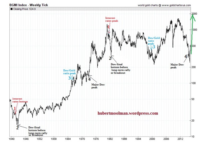
The following chart (from sharelynx.com) supports the bullish outlook for gold stocks:

It is a long-term chart of the Barron’s Gold Mining Index (BGMI). On the chart, I have marked two patterns from 1 to 4, by highlighting certain significant financial events. Point 1 on both patterns is the turnaround point for interest rates. On the older pattern, it was the point where interest rates started to increase, whereas on the newer pattern it was a point where interest rates started to decrease.
Point 2 on both patterns is the final Dow bottom just before a major rally, or a point where the Dow broke out. Notice how gold stocks started a fake rally (from around point 2) in both cases. They started a rally, promising a new bull market, but soon they diverge from the general stock market (which continued on a long-term rally).
Point 3 on both charts is the Dow/Gold ratio peak. This represents a signal that the tide is “soon” turning, from favouring general stocks to favouring gold stocks.
Point 4 on both charts is the major peak for the Dow. After point 4, the “real” gold stocks rally starts. The recent rally of gold stocks is a confirmation of this. A Dow crash is the only outstanding signal. This rally will outperform the 1970s rally by a large margin, due to the more ideal conditions with regard to commodity prices, debt levels, the economy, etc.
********
For more on this and this kind of fractal analysis, you are welcome to subscribe to my premium service. I have also recently completed a Gold Mining Fractal Analysis Report as well as a Silver Fractal Analysis Report.
********
FREE Silver Phoenix 500 Newsletter!
- Fresh insights on the Silver market and the economy
- Leading authors from around the world
- FREE
- Stay informed!!


