Silver Prices: Silver Is Looking Really Bullish In Dollars, Euros And Rands
Silver In South African Rand
The South African Rand is often a leading indicator for where silver (in dollars) is going, as previously explained. Furthermore, the chart of the silver price in rands can often provide very clear signals or patterns of what might happen to price.
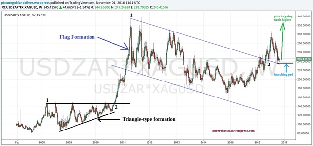
Currently, the silver price in rands provides the clearest signal (in my opinion) that silver is going to go very high in price. Below is a silver chart in South African rands:

The clear signal comes in the form of a flag-type formation. The price has already broken out of the line at the top of the flag, and is currently busy with a retest of the breakout area. When the retest is successfully completed (which might be soon), then price will spike higher in a very aggressive manner.
The correction since 2011 is similar to the one since 2008, except that the formation is a flag-type one instead of a triangle-type one since 2008.
Silver In Euros
The euro silver chart also has a flag-type pattern, however it is not as clear as the one on the rand silver chart. Furthermore, the comparison of the post 2011 and post 2008 consolidation is also not so apparent.
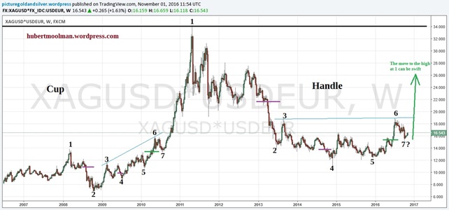
However, if we apply some fractal analysis techniques, then the picture becomes clearer. Below, is a silver chart in Euros:

On the chart, I have marked the two consolidations (1 to 7) to show how they might be similar. Based, on the comparison, we are now at a point similar to August 2010. Once point 7 is confirmed, then the silver price could move very quickly to the high at point 1.
Due to the position of the current point 7, within the larger pattern (cup-and-handle pattern); I do not expect the move to the high at point one to take as long as the move in 2010/2011 took – it will be much quicker.
Silver In US Dollars
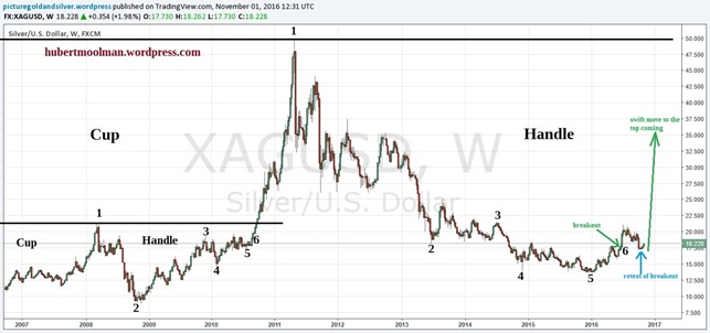
Currently, Silver in US dollars is probably more bullish than in any other major currency. Below, I have also applied some fractal analysis techniques on the US dollar silver chart:

On the silver chart, I have highlighted two patterns that appear similar. I have marked them 1 to 6 to show how they might compare. Both patterns start from a significant silver top. Both patterns represent the end part or handle of a cup and handle-type pattern. If the comparison is justified, then we are currently just after point 6, the point where a major breakout occurred.
We have now retested point 6, and could see a swift move to the all-time high over the coming months. The move might be extremely fast, for the same reasons given above (see Euro Silver Price).
For more of this kind of fractal analysis, you are welcome to subscribe to my premium service. I have also recently completed a Silver Fractal Analysis Report as well as a Gold Mining Fractal Analysis Report .
Free Gold-Eagle Newsletter!
- Fresh weekly insights on gold, precious metals, and the economy
- Leading authors from around the world
- Always free
- Stay informed!


