Three Gold Price Ratios You Need To Pay Attention To
Regular readers will remember that the ratio of the price of gold to the price of silver is one of the top variables we look at when determining which of the two precious metals is the better bargain.
But if you really want to understand the historical context of the current gold prices, you have to look at it from multiple angles. After all, the traditional gold-silver ratio is usually used to look at how silver is performing, not gold. When it comes to gold, there are a few other ratios that you can spend time examining in order to get a fuller understanding of the yellow metal. Here are three of the most important ones:
#1: S&P 500 To Gold
MacroTrends.net has this chart for you, allowing you to view data back to before the Great Depression.
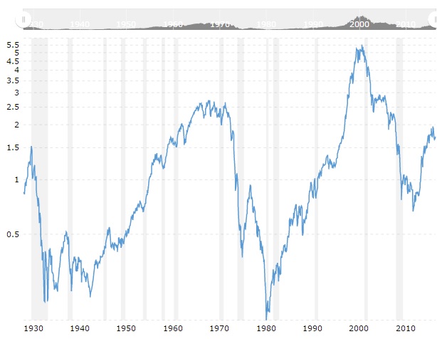
What do we see here? First, there are some wild - and lengthy - fluctuations. Although the general median seems to be somewhere within the realm of 1 to 1.5, the S&P stayed very low, relative to gold, during the Great Depression and World War II, and then again during stagflation in the late 1970s. It’s clear the S&P was overvalued in the days before the tech bubble burst, as well, although there’s nothing here indicating a similar bubble was going to pop before the Great Recession.
For recent context, the S&P has been in the range of about 1.75 to 1 over the past couple of years, suggesting that stocks may still be slightly overpriced relative to gold. Of course, if you’re investing in gold, you’ll likely want to stick around for a long enough time to see if the S&P might dip below the average once again.
#2: The Dow To Gold Ratio
If you’re interested in how the stock market is performing when priced in gold, then the Dow to Gold ratio is the second one you’ll want to pay attention to:
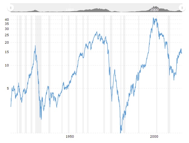
Although we can see that the trends are similar to the S&P-to-gold ratio, there are some interesting differences. First, the Dow tends to have a higher ratio to gold (as we would expect), but, also, that it seems to even be above its historical median.
Like the S&P, the Dow Jones seems slightly above its historical average, relative to gold, further suggesting that even with relatively high gold prices, the stock market may not be all it’s cracked up to be.
Gold To Monetary Base
This ratio suggests that the gold bull market isn’t only far from over, but it may, in fact, simply be in a holding pattern before it begins in earnest.
Simply put, this is the ratio of the price of gold to the St. Louis Adjusted Monetary Base, which “roughly matches the size of the Federal Reserve balance sheet, which indicates the level of new money creation required to prevent debt deflation,” according to MacroTrends. For example, the bull market in the early 1980s ended once the ratio got too high.
Right now, the ratio is extremely low - far below its average:
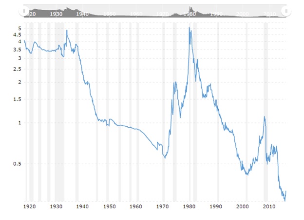
Although this is just one indicator, it’s an indicator worth watching - and another one that suggests that gold has plenty of upward room if it’s going to make a move later this year or into 2017.

Darren Capriotti has been a market analyst for the past decade and is an expert in precious metals. He prides himself on his ability to analyze the market and offer true value to investors with questions about gold, silver, and other precious metals. Highly educated, incredibly passionate, and more accurate than most, Darren offers a true, unbiased look into what investors can expect in the precious metals market. You can reach Darren at [email protected].
More from Gold-Eagle.com: